Introduction
Specialty coffee is evaluated by its cover in a highly competitive market way before the first cup of coffee. The most important point of intersection between your brand story and technical preservation is your packaging, acting as an extension of a brand. It has to capture the attention of a consumer and protect volatile aromatic compounds against oxidation to extend coffee shelf life. This roadmap will give you the strategic map to take your idea on paper to a market-ready product that does not compromise the integrity of your roast and the power of your brand.
Why Coffee Packaging Design is Crucial for Your Brand?
Going by the consumer journey, the packaging is the first point of introduction on store shelves. The packaging is the initial taste of your coffee metaphorically. At first glance, the customer has already made a judgment of the acidity, the body, and the quality of the product before the water even touches the coffee grounds, based on the texture of the bag of coffee and your color choices.
The physical burden of the packaging plays a critical role in addition to the psychological effect. Coffee is a living breathing product. After roasting, it starts a rapid de-gasification process and is at the same time prey to its three main predators, oxygen, moisture and light. A beautiful design that does not offer a high-barrier seal is a failure of the brand. A lasting impression relies on freshness; if the coffee is stale when the customer opens it, the most beautiful typography in the world will not get you a repeat purchase. Thus, your design should convey high quality and accommodate the technology, including one-way degassing valves and multi-layer laminates, which halts the clock on oxidation.
Mastering the Elements of Coffee Packaging Design
In order to create effective packaging design, it is necessary to consider a number of different dimensions of sensory experience of the consumer. These design elements can be subdivided into certain areas of focus that determine the perception of a brand in the split second of a buying decision.
The Psychology of Colors in Strategy
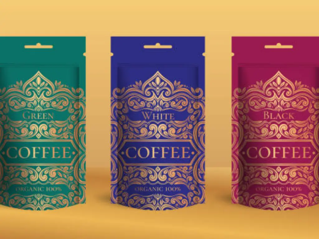
The closest communicator in conveying your brand identity is color. Colors are frequently used in the coffee world to refer to the roast levels or flavor profiles. Dark, dark green and brown colors imply natural sources and natural procedures. On the other hand, modern third-wave roasters often use bright, neon palettes or pastel gradients to indicate experimental fermentation or light, floral roasts. The selection of a color is not only a matter of personal taste, but also a matter of expectations management. A yellow bag can be a good indication of citrusy acidity, and a dark burgundy could be an indication of dark fruit or wine-like aroma.
The Typographic Voice and Cross-over Design Innovation
Typography and layout are a powerful tool for establishing your brand tone, conveying the brand’s message even before the copy is read. Minimalism employs large sans-serifs and wide white space to indicate contemporary efficiency and clinical cleanness. This visual silence is a theater, which deprives the noise and makes the consumer concentrate on the authority of the brand. On the other hand, Retro-Artisanal styles use beautiful serifs and natural handwriting to create an impression of tradition and individual craftsmanship, implying a human-based roasting process.
To create an emotional connection and go beyond the usual tropes, brands are moving towards Cross-over Design, borrowing visual elements of unrelated industries such as 1980s VHS tapes or craft beer cans to create a pattern interruption. This plan controls cognitive attention by substituting the well-known tropes of coffee with curiosity. The packaging is turned into a cultural object by placing visual anomalies over the anticipated patterns, so that the product is not merely perceived, but recalled as a distinct lifestyle statement.
Touch and Weight Sensory Psychology
The touch of the bag narrates a story that cannot be seen. A matte finish can be more modern and high-end to touch, and a high-gloss finish can be more commercial and high-volume. The weight is also a major factor; a heavier, firmer bag feels heavy and safe, and the buyer subconsciously believes that the contents of the bag are worth something. The use of textures such as soft-touch finishes or embossed logos will provide an element of inter-activity that will prompt the consumer to hold the product longer, raising the chances of making a sale when they are evaluating different coffee products.
Hierarchy of Information and User Interface
Good packaging arranges key information in such a way that the reader does not need to strain to get it. Clear labels should highlight essential information like the brand and the type of coffee on the first level. The second level consists of the roast level, different blends, and flavor notes. The third level includes key details such as altitude, varietal and processing method. Smart packaging is a new component that has gained importance in the recent past. The inclusion of a QR code will enable the design to be clean and minimalist and will give the customer an in-depth look into the history of the farm or a tutorial on how to brew the beer through their smartphone.
Balancing Coffee Packaging Design with Printing Costs
One of the pitfalls that startups make is to design a bag that is too costly to make in small quantities. The connection between the complexity of design, the printing techniques, and Minimum Order Quantities (MOQs) is crucial to healthy margins.
Printing Method | Best For | Quality Level | Relative Cost per Unit | Typical MOQ |
Digital Printing | Small batches, seasonal releases | High | High | Very Low (100 – 500) |
Flexographic | Mid-to-high volume | Moderate to High | Medium | Medium (5,000+) |
Rotogravure | Large scale production | Superior | Low (at scale) | High (10,000+) |
Digital printing is the most available path to new brands since it does not need any plate fees and can have numerous designs (SKUs) on a single order. But at scale, rotogravure printing provides the most consistent color and the lowest unit cost, but the initial cost of copper cylinders can be high. Before investing in a particular printing technology, it is important to estimate your sales volume.
Selecting the Best Packaging Format for Your Coffee
The physical design of your coffee packaging determines your canvas on which you will paint, influences your production budget and determines the feel of your customer. The first step in any effective design strategy is the selection of the appropriate shape.
Traditional Coffee Bags
This is the most flexible type in the industry, which is typically split into three traditional forms:
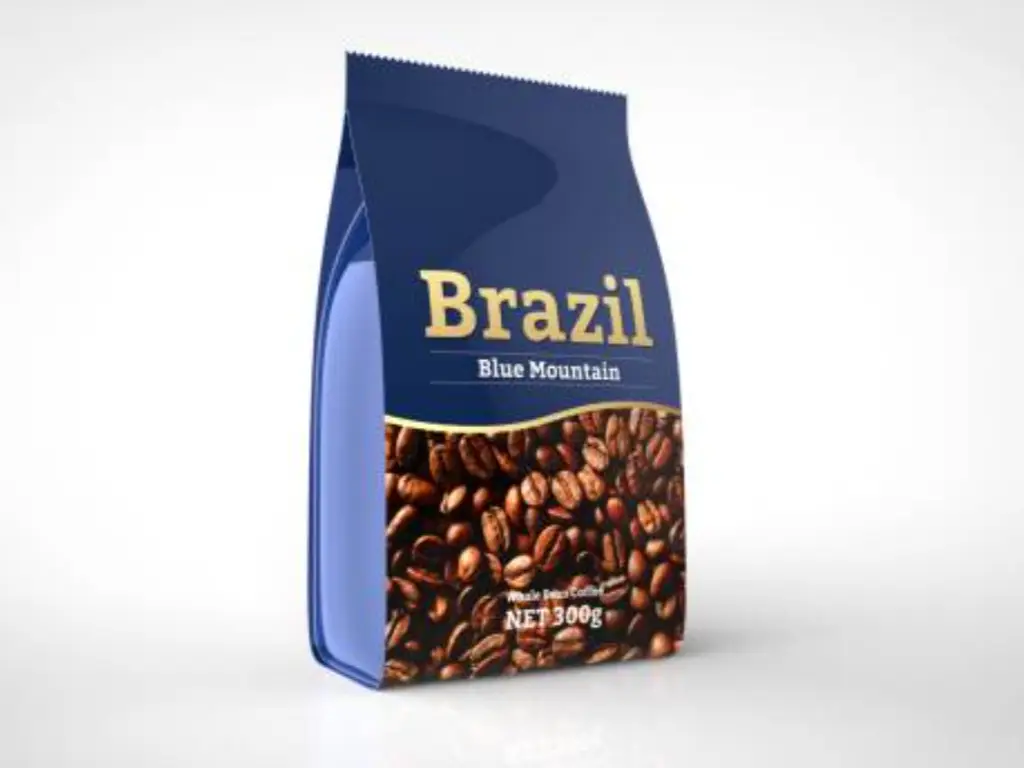
Flat Bottom Bags (Box Pouches): This is the gold standard of specialty coffee, and the shape resembles a heavy, flat-bottomed box. It offers five totally flat, hard surfaces that will not distort your artwork when filled. It is more expensive to manufacture, but the end product is the canvas on which to paint high-end single-origin roasts and intricate, edge-to-edge drawings.
Stand-Up Pouches (SUP): The workhorse of the retail market. It has a bottom gusset to stand straight and a resealable zipper that is easy to use by the consumer making it a balance between cost-efficiency and high utility. The slight frontal protrusion when filled requires designers to consider it as the most appropriate in centered logos and daily espresso blends.
Side Gusset Bags: These bags are distinguished by their expandable sides and have a huge volume capacity at a very low price. They are usually closed with a tin-tie, which produces an old-fashioned, craftsman-like roastery look. They do not need a modern zipper, and they are ideal when the client is a fast-consuming wholesale B2B cafe or a large 1kg format.
Coffee Cans and Tins
Tins make coffee a daily shopping product a luxury present, providing maximum security against light and oxygen. Shipping and production expenses are much greater, but well-designed tins can be stored at home by consumers, which offers years of secondary brand recognition to limited-edition reserve beans.
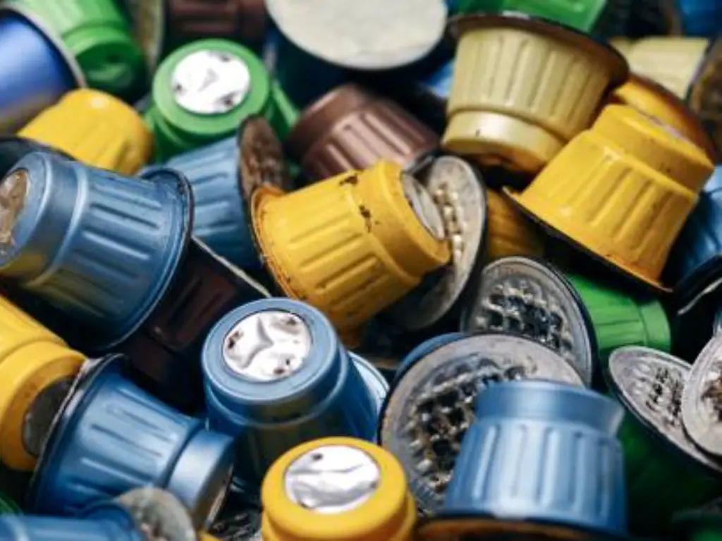
Coffee Capsules and Pods
Single-serve pods require the utmost design minimalism due to the convenience of use at home. You have to convey a strong brand image on a foil lid that is no bigger than a coin, and you have to do it with the help of impressive color-coding and very readable logos. The materials should also perfectly blend with high speed filling equipment.
How to Choose the Right Structure for Your Brand
The shape of your design should be determined by your design requirements and business plan before you finalize your dielines:
Assess your art: In case your visual identity is based on large, edge-to-edge drawings, invest in the hard canvas of a Flat Bottom Bag. A Stand-Up Pouch will be ideal in case you have a minimalist sticker label that is centrally positioned.
Go with your price: Justify the high price of an exclusive Geisha roast with a high-quality Tin or Flat Bottom Bag. With your high-value, everyday house blend, the Stand-Up Pouch keeps you competitive.
Take into account user experience: A slow-drinking home user will be in dire need of the zipper of a Stand-Up Pouch to keep the beans fresh, but a busy barista who burns 5 kilos of coffee a day will be glad to have an easy-pouring large Side Gusset Bag.
How Packaging Design Keeps Coffee Fresh?
Exceptional coffee packaging involves internal engineering that will ensure that the roasted coffee beans are not exposed to oxygen, light, and moisture. This is the way in which preservation technology is adjusted to various physical structures.
Flexible pouches are based on multi-layer laminations (mixtures of such materials as PET and aluminum foil) to prevent UV light and moisture. Since freshly roasted beans emit huge volumes of carbon dioxide, a one-way valve is a must to avoid the bag bursting. The trick here is the strategic placement of the coffee degassing valve- you need to fit it in your dieline in such a way that it does not interfere with your main logo or barcode. The last thing to do is to add a premium resealable zipper to seal out oxygen after the consumer opens the bag.
Metal offers a physical barrier that is impenetrable. Cans are designed to ensure maximum freshness prior to the initial use, typically through internal hermetic sealing, typically an airtight peel-off foil membrane concealed under the main lid. It is an enormous benefit to designers: the exterior tin is not compromised at all, and you have a full, uninterrupted canvas to create high-quality artwork and brand narratives without worrying about functional cutouts.
Since capsules are filled with pre-ground coffee, the amount of surface area that is exposed to oxygen is enormous, and therefore, it is highly susceptible to rapid staling. The preservation plan occurs at the manufacturing line altogether. Production of quality nitrogen flushed coffee pods entails the replacement of the oxygen in the small cup with nitrogen immediately before the foil lid is closed. This serves as a protective barrier to the fragile coffee oils so that you can concentrate on the visual effect of the lid to the fullest.
Eco-friendly Packaging Options that Consumers Actually Want
The current coffee consumers are demanding sustainability, yet the green packaging should not affect the freshness of the roast. To achieve a balance between environmental impact and high-barrier protection, it is necessary to make strategic material decisions instead of making unspecificated marketing statements.
The real sustainability may begin with the simplification of the structural engineering of the bag. Conventional pouches are based on mixed-material laminates which are notoriously hard to recycle. A transition to mono-material plastics, including pure Level 4 LDPE, enables the empty bag to be placed in regular flexible recycling streams and effectively exclude oxygen and moisture.
When it comes to brands that are aimed at a zero-waste lifecycle, the use of renewable and plant-based options such as PLA or sugarcane bagasse is a very convincing option. Nevertheless, your design should be focused on complete transparency. It is important to specify whether the packaging is industrial compostable (needs commercial high-heat facilities) or home compostable to a backyard bin. More to the point, when the bag body is organic, but the one-way degassing valve is made of standard plastic, then your typography should clearly tell the user to cut the valve out prior to composting. Instructional design is honest and creates much more brand loyalty than greenwashing.
Alternatively, adding Post-Consumer Recycled (PCR) content is a direct method of reducing your carbon footprint now. Reusing the plastics that already have a lifecycle behind them will save you a tremendous amount of virgin material requirements, and you will still have the same high-quality tactile finish and structural integrity that your customers are accustomed to.
Perfecting Capsule Designs for the Actual Production Line
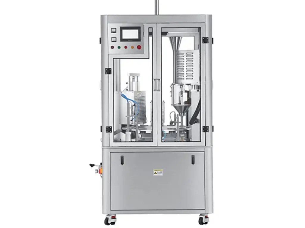
The beauty of a coffee capsule design is as good as it can be manufactured. Although the consumer is attracted by the eye-catching typography and colorful foil lid on a small foil lid, the structural integrity of such a package during high-speed filling is what ultimately defines the quality of the final cup. When the materials you have selected, be it eco-friendly compostable bioplastics or high-quality aluminum, cannot handle the precise amount of heat, pressure, and speed of a commercial packaging line, the whole brand experience falls apart before the product even makes it to the shelf.
This is the reason why the choice of the proper production equipment is as important as your design stage. The equipment should be in perfect harmony with your material preferences. It must be able to perform perfect edge seals and nitrogen flushing without distorting or tearing the fragile printed foil. A microscopic misalignment or an uneven heat seal in the manufacturing process automatically nullifies the protective oxygen barrier, resulting in stale coffee, exploded pods and a seriously damaged brand image. It is the right packaging equipment that actually transforms a theoretical design into a shelf-stable product.
In order to make sure that your carefully planned coffee pods are produced with no concessions, you must have the equipment that is designed to work with the specific material and seal it perfectly with no errors, and this is where the specialized coffee capsule packaging equipment by Saneu comes in to fill the gap between the brilliant design and the production reality.
Bringing Your Packaging Designs to Life with Saneu
Saneu has been enabling more than 100 international coffee brands to transform innovative packaging designs into perfect shelf-ready reality over 12 years. Your aesthetic demands high-quality canning lines, flexible VFFS bags, or environmentally friendly compostable capsules that can be used with Nespresso and K-Cup, our equipment is perfectly adjusted to your material preferences.
We know that speedy production should never affect the aesthetic quality of your packaging or the taste of the coffee. Our equipment is driven by the industry-leading components of Siemens and Schneider and provides an impressive ±0.1g filling accuracy, keeping your fine pod lids and seals looking as good as they did before. Moreover, the industry standard of nitrogen flushing is 99.5, but Saneu has an outstanding 99.9% nitrogen environment. This extremely low residual oxygen content ensures that the freshness of your roast is absolutely equal to the high-end appearance of your design.
Supported by global certifications, two-year warranty, and lifetime technical support, Saneu provides the reliability of world-class production at a 30 percent lower equipment price than the competitors- you can easily grow your coffee brand without busting the budget.
Avoiding Expensive Coffee Packaging Design Mistakes
Even seasoned designers may get into traps that lead to lost inventory or unsuccessful product introductions. The main pitfalls to be avoided are the following:
Valve Placement Errors: It is a common mistake to put the degassing valve in the center of your main logo or right over important text. Always ask your supplier to provide you with a physical template or dieline indicating the precise location of where the valve will be punched.
The Kraft Paper Oil Leak: Unlined Kraft paper is used by many brands to give the appearance of being organic. But dark, oily roasts will finally leak through unlined paper, leaving grease spots on the bag that are not very pretty. A high-barrier internal liner (such as VMPET) should always be used when you are packaging medium-to-dark roasts.
Barcode Scannability Problems: Retail scanners need a high contrast barcode to read. A dark brown barcode printed on a matte black bag may appear smooth, but it will be rejected by the majority of large retailers. Make sure the background of your barcode is white or a very light and solid color.
Disregarding the Bleed and Safe Zones: Bags in high-speed production are cut and sealed with a small margin of error. When you design something with valuable text too near the edge, it can be cut off or lost in the side seal. Critical information should always be stored in the safe zone given by the manufacturer in the dieline.
Free Tools and Resources to Start Designing Today
You do not require a huge budget to start the design process. A number of professional grade resources can assist you in creating a prototype.
Dieline Downloads: The majority of well-known packaging manufacturers offer free PDF or AI templates of different bag sizes. Beginning with a precise dieline means that you have the right dimensions at the very beginning.
Blueprint (3D Mockups): Blueprint or Adobe Dimension are tools that enable you to wrap your 2D artwork around a 3D model of a coffee bag. This will assist you in imagining how the design will go round the sides of a side-gusseted bag.
Vector Assets (Freepik/Vecteezy): In case of the lack of a personal illustrator, the sites provide high-quality vector illustrations of coffee branches, beans, and textures that can be used commercially.
Paletton: A free color theory exploration tool. It assists you in locating complementary or triadic color schemes that make your packaging look balanced and professional.
FontSquirrel: FontSquirrel is a curated collection of free, commercially licensed fonts that can help your brand have a distinctive typographic voice without the high expense of a custom foundry license.
Conclusion
The design of coffee packaging is the connection between the hard work of the farmer and the daily ritual of the consumer. It is a science that demands you to be both narrator and guardian. You can make a package that is more than just a container of beans by knowing the psychology of your customer, the technical needs of freshness, and the economic truths of printing, you can create a package that is not only a container of beans, but also a brand.
The coffee industry is not a business that can be successful by chance; it is a business that is planned and partnered with the right partners. As you proceed with your design, keep in mind that it is the quality of the machinery that you use to fill and seal your design that will ultimately save your reputation. The capsule is a small pressure cooker and its integrity is the ultimate test of your brand. Regardless of whether you are targeting the old school bags or the new capsule market, the experience of the consumer should be at the center of all your decisions.